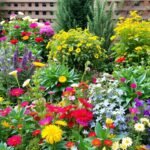
Your backyard holds untapped potential to become an emotional sanctuary through smart plant selection. Strategic combinations of blooms and foliage can turn ordinary flower beds into visual symphonies that calm your mind or spark joy.
Landscape architects have long understood how different tones affect mood. Soft lavender paired with silvery greens creates serenity, while fiery reds mixed with golden yellows deliver vibrant energy. These interactions work because our brains respond to hues instinctively – a principle you can apply through thoughtful arrangement.
Surrounding elements dramatically shift how plants appear. A crimson rose bush pops against a white fence but fades near terracotta walls. By considering existing structures and seasonal changes, you craft year-round visual harmony that feels intentional. Discover how to elevate your outdoor aesthetic through purposeful repetition and contrast.
This guide reveals professional techniques for balancing bold statements with subtle accents. You’ll learn to use focal points effectively while maintaining natural flow. Whether creating a peaceful retreat or lively entertainment zone, these methods help translate personal style into living art that evolves through the seasons.
Understanding the Fundamentals of Color Theory in Gardening

Colors in your landscape communicate moods through their visual language. The color wheel acts as your essential guide, revealing how hues interact to create harmony or contrast. Let’s break down these principles to help you craft spaces that feel intentional at every glance.
Exploring the Color Wheel, Warm and Cool Tones
Red, blue, and yellow form the foundation of all other shades. Mix these primary colors to create secondary options: orange (red+yellow), green (blue+yellow), and purple (red+blue). Tertiary colors like red-orange or blue-green add nuanced options for sophisticated combinations.
“Warm tones energize spaces, while cool hues create depth – it’s like painting with living plants.”
| Color Type | Examples | Effects | Best Use |
|---|---|---|---|
| Warm | Red, Orange, Yellow | Excites, draws attention | Focal points |
| Cool | Blue, Green, Purple | Calms, recedes | Backgrounds |
| Variable | Purple | Adapts to neighbors | Transitions |
Primary, Secondary, and Tertiary Colors in Landscapes
Yellow marigolds pop against blue salvias because complementary colors intensify each other. Soften intense shades with tints (colors + white) or deepen drama with shades (colors + black). Remember that color value changes throughout the day – test samples in different light conditions.
Cool greens make narrow spaces feel airy, while warm oranges bring distant beds forward. This temperature trick helps balance proportions in any size yard. For purple’s dual nature, pair lavender with pink for warmth or violet with silver foliage for cool elegance.
The Influence of Plants and Foliage on Garden Color Schemes

Your landscape’s visual rhythm thrives through more than petals alone. Leaves offer dynamic textures and hues that shape spaces with year-round character. While blooms come and go, foliage provides the steady backbone of your design.
Using Variegated Leaves and Foliage Colors
Variegated plants break the “green only” stereotype with striped or mottled patterns. Hostas with cream-edged leaves brighten shady corners, while coleus splashes pink and purple into sunlit beds. These multi-toned wonders work like natural paintbrushes – their striped leaves tie together neighboring colors.
Treat patterned foliage as you would bold flowers. Pair silver-edged ivy with lavender blooms, or contrast golden Japanese forest grass with burgundy heuchera. Remember that variegation needs balance – too many patterns create visual chaos.
Integrating White Flowers and Bold Plant Accents
White flowers act as peacemakers in vibrant spaces. Shasta daisies cool down red poppies, while gardenias bridge purple salvia and yellow coreopsis. For drama, add plants with dark foliage – black mondo grass makes snowdrops pop like stars.
Deep-hued leaves serve as permanent accents. Purple smoke bush maintains intrigue after peonies fade, and red-tipped photinia shrubs anchor autumn displays. As noted in this color theory guide, these elements follow the same rules as blooms.
Don’t overlook foliage’s seasonal shifts. Maple leaves transition from lime-green to crimson, offering evolving backdrops for your container arrangements. By prioritizing leaves, you craft spaces that captivate long after petals drop.
Essential Color Schemes: Monochromatic, Analogous, and Complementary

Discover how professional designers create mood through intentional hue selection. The secret lies in choosing relationships from the color wheel that align with your space’s personality. These combinations transform random plantings into cohesive visual stories.
Monochromatic Magic
Single-color designs whisper elegance. Imagine lavender phlox with deep violet irises and pale lilac asters. This approach uses shades and tints of one hue to create depth without competition. Perfect for meditation corners or narrow walkways.
Neighbors and Opposites
Analogous schemes blend adjacent wheel colors. Try coral begonias fading into peach roses, then lemon marigolds. For drama, pair opposites like purple and yellow – crocuses with daffodils make both glow brighter.
Creative Twists
Split-complementary designs offer balanced energy. Pair blue hydrangeas with apricot daylilies and amber mums. Diadic choices like magenta peonies and sky-blue delphiniums add playful contrast without overwhelming. Test these combos in different sunlight conditions to see their true potential.
Remember: Cool tones recede, making small spaces feel larger. Warm hues like orange command attention – use them sparingly near seating areas. Your garden becomes a living canvas when colors collaborate purposefully.
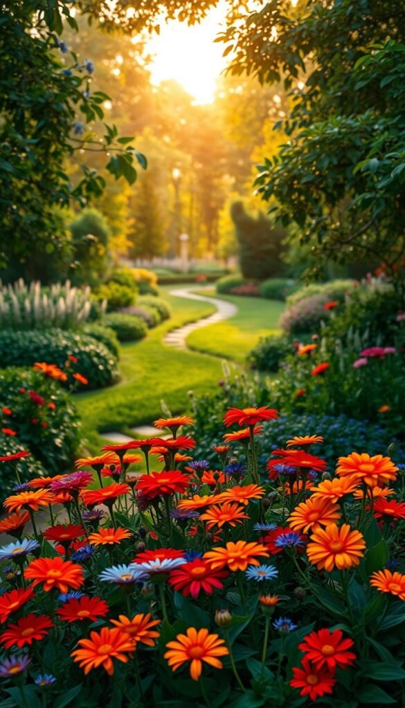
Using Color to Create Garden Focal Points and Visual Interest

Strategic placement of hues acts like invisible signposts in your landscape. Warm tones like fiery orange daylilies pull focus toward benches or sculptures, while cool blue hydrangeas make narrow patios feel spacious. This push-pull effect helps shape how visitors experience your space.
Attracting the Eye with Contrasts and Emphasis
Bold contrasts create instant drama. Picture white Shasta daisies glowing against chocolate coleus leaves, or crimson roses popping beside silver artemisia. These pairings make specific features command attention naturally.
Cool-colored plants work behind the scenes. Lavender bushes planted along fences make yards appear deeper, while yellow coreopsis near pathways brings borders forward. This spatial trick helps small areas feel balanced and intentional.
Seasonal shifts offer rotating highlights. Spring tulips give way to summer phlox, then autumn maples take center stage. By planning these transitions, you maintain visual intrigue year-round without overcrowding the space.
Subtlety often speaks loudest. A single purple iris among green hostas draws more interest than a rainbow bed. As noted in this guide to color principles, restraint prevents sensory overload while emphasizing your design’s best features.
Integrating Seasonal Color Changes into Your Landscape
Nature’s calendar offers four distinct opportunities to refresh your outdoor canvas. By anticipating how plants shift through the year, you maintain visual harmony even as temperatures fluctuate. This forward-thinking approach lets every season highlight your space’s best features.
Adapting Schemes for Spring, Summer, Fall, and Winter
Spring’s pastel tulips give way to summer’s bold zinnias. Pair golden mums with crimson maples in autumn, then let red-twig dogwoods star in winter. Rotate annuals in patio container setups for instant seasonal updates without overhauling beds.
Evergreens like boxwood provide steady structure. Deciduous shrubs add surprise – imagine hydrangeas fading from pink to parchment. Mix both types to balance consistency with dynamic shifts.
Planning for Evergreen Versus Deciduous Color Impacts
Silver-blue junipers anchor spaces where cherry blossoms come and go. Purple fountain grass thrives until frost, then yields to holly’s scarlet berries. Pro tip: Use perennials like heuchera for foliage that returns yearly, reducing replanting work.
Track sunlight changes as seasons progress. A spot bathed in summer sun might become shaded in fall. Test plant placements to ensure colors pop year-round. With thoughtful prep, your yard becomes a living showcase of nature’s endless creativity.