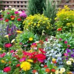
Creating inviting outdoor spaces starts long before the first shovel hits the dirt. Your visual identity acts as the root system connecting professional skills to clients’ dreams of lush gardens and serene patios. Like perfectly pruned hedges, every curve and color in your emblem tells a story about your horticultural artistry.
What separates forgettable symbols from memorable marks? They balance practical expertise with emotional resonance. Clients don’t just want service providers – they seek partners who understand their vision of transforming yards into personal retreats.
Consider how elements like leaf motifs or watercolor textures create instant recognition. These choices signal attention to detail while reflecting nature’s organic beauty. Your emblem becomes the gateway to trust, appearing on everything from work uniforms to digital ads.
The right visual approach positions you as the obvious choice in a crowded market. It’s not just about plants and pavers – it’s about crafting an identity that grows alongside client relationships. Let’s explore how to design marks that blossom in any business environment.
Understanding Your Landscaping Brand Identity
![]()
Your logo acts as the first handshake between your services and potential clients. It’s where first impressions take root. Before sketching designs, dig into what makes your operation distinct – are you reinventing outdoor spaces with cutting-edge techniques or preserving timeless gardening traditions?
Defining Your Brand’s Core Values
Start by mapping your specialties. Do you craft drought-resistant xeriscapes or build tranquil water features? Each service requires tailored visual storytelling. A company focusing on sustainable practices might use recycled paper textures in their emblem, while luxury patio designers could opt for gold leaf accents.
Values like affordability or craftsmanship need clear signals. Earthy greens say “eco-friendly,” while sleek geometric shapes whisper “modern innovation.” Balance professionalism with warmth – sharp lines show expertise, while rounded fonts feel approachable.
Translating Personality into a Logo
Think about client aspirations. Are they dreaming of low-maintenance yards or extravagant outdoor kitchens? Your mark should mirror these desires. Established companies might modernize their look with simplified icons, while startups can make bold statements through unexpected color pairings.
Consider how a koi pond specialist uses fluid shapes differently than a tree-trimming service. Every curve and shade becomes part of your visual language. The goal? Create something that feels instantly familiar to your ideal customers, like recognizing their favorite plant in a crowded nursery.
Key Elements of a Successful Garden Logo

Color wields surprising power in professional landscaping marks. While 83% of top-rated service providers use green hues, the magic lies in how you apply them. A gradient shifting from mossy olive to emerald doesn’t just look pretty – it visually demonstrates your ability to revive lackluster spaces.
Choosing the Right Color Palette and Typography
Earth tones like terracotta orange or slate gray ground your design in natural elements. Pair these with accent colors matching your specialty – think azure blues for pool landscaping or sunflower yellows for garden installations. “Fonts are the soil where your brand personality grows,” notes award-winning designer Mara Lin. Serif typefaces work for heritage-focused businesses, while clean sans-serifs suit tech-driven lawn care apps.
Integrating Nature-Inspired Imagery
Move beyond literal leaf shapes. Try abstract water droplets for irrigation experts or geometric hedge patterns for topiary artists. One midwestern company increased client inquiries by 40% after replacing generic tree icons with custom-designed bark textures in their emblem.
Balance remains crucial. A vibrant floral motif might overpower minimalist typography, while subtle grass blade patterns can enhance readability. Test your design at thumbnail size – if details blur, simplify while keeping the essence intact.
Boost Your Brand with Unique Garden Logo Design Ideas for Landscaping
![]()
In a field blooming with clichés, your emblem can be the wildflower that captures attention. While competitors settle for predictable leaf motifs, forward-thinking companies are cultivating fresh visual languages that reflect both nature and innovation.
Innovative Visual Elements for Modern Appeal
Why stick to basic green palettes when fiery marigold oranges and passionate geranium reds could showcase your flair? These vibrant shades nod to flowering specimens while creating instant recognition. A lawn care specialist might layer multiple leaf silhouettes in sunset hues, suggesting daily transformations.
Creative symbolism works wonders for niche services. Soil enhancers could visualize accelerated growth through Russian doll-style vegetables – each layer revealing bigger produce. Hardscape installers might abstractly arrange paving stone patterns into geometric badges of precision.
Reinvent everyday equipment into striking icons. A stylized watering can dripping liquid gemstones conveys luxury irrigation solutions. For urban landscaping firms, building facade outlines merged with vine illustrations bridge architecture and botany.
Timeless appeal meets contemporary style when combining organic shapes with crisp negative space. Fluid lines suggest natural growth, while sharp angles represent tailored solutions. This balance ensures your mark remains relevant through shifting trends.
Modern Approaches: Minimalism and Professional Wordmarks
![]()
In today’s design landscape, less truly becomes more when shaping professional identities. Clean lines and strategic typography create marks that communicate expertise while adapting seamlessly across platforms.
Embracing Minimalist Logo Trends
Simplified designs cut through visual noise like a well-maintained hedge. A study by DesignRush shows 68% of top-performing landscaping companies use single-color logos for better scalability. Consider these advantages:
- Instant recognition: Sharp typography works on lawn signs and app icons alike
- Adaptive color schemes: Use forest green for print materials, switching to monochrome for embroidery
- Timeless appeal: Avoid trends that wilt faster than seasonal blooms
Typography becomes your secret weapon in minimalist logo design. Serif fonts like Playfair Display suggest heritage, while geometric sans-serifs like Futura signal innovation. “Your font choice is the soil where brand personality takes root,” observes designer Eli Martinez.
Subtle nods to nature keep designs grounded without clutter. Try these techniques:
- Negative space shaping leaf outlines within letters
- Custom glyphs resembling gently curved garden tools
- Texture overlays mimicking weathered stone or bark
Digital optimization matters more than ever. Minimalist logos load faster on mobile sites and remain crisp in social media thumbnails. By focusing on essentials, your logo stays evergreen through shifting design trends.
Inspirational Examples from Leading Design Trends
![]()
Great logos grow from understanding how others have cultivated success. Let’s examine standout approaches that thrive across markets.
Case Studies Drawing from Award-Winning Designs
Plantify’s emblem demonstrates smart simplification. It combines a spade silhouette with abstract leaf veins – merging tools and nature without clutter. This approach keeps landscaping logos professional yet approachable.
Ryan Williams’ leaf-spade combo takes a different route. The organic leaf shape contrasts with crisp tool outlines, proving contrast creates memorability. “Details should serve the concept, not overwhelm it,” notes Williams.
Visual Inspiration from Real-World Applications
Home Grown’s retro chalkboard style shows intricate designs work when aligned with brand personality. The vintage font pairs with hand-drawn vegetables – perfect for artisanal nurseries targeting nostalgic clients.
Analyze how these landscaping logo designs adapt across materials:
- Plantify’s mark scales perfectly from truck doors to mobile screens
- Williams’ design uses color variations for embroidery vs. digital ads
- Home Grown’s detailed illustration pops on packaging but simplifies for social media
Your inspiration should balance creativity with practical needs. Notice how successful logos maintain core elements across applications while adjusting secondary details. This flexibility helps businesses grow without losing brand recognition.
Tailoring Your Logo to Fit Your Landscaping Business
Your emblem should feel as intentional as the services you provide. While competitors grab generic icons, your mark can showcase what makes your operation distinct. Think of it as visual shorthand that tells clients exactly what to expect before they read a single word.
Strategic Symbol Selection
Choose tools that mirror your specialty. Pruning shears work for meticulous garden care, while excavators suit hardscaping companies. Customized equipment graphics prevent confusion – clients instantly recognize your focus area. Solo ventures might blend personal names with subtle leaf motifs, balancing individuality with professionalism.
Scale matters. Small operations benefit from approachable designs using hand-drawn textures. Larger companies often need streamlined marks that translate well across fleet vehicles and corporate materials. Residential gardening logos might use warm earth tones, while commercial services lean toward bold, authoritative colors.
Test your design’s clarity. Does it read clearly on invoices and mobile screens? Does the tool imagery align with your primary offerings? A well-crafted logo becomes your silent partner, building trust through every interaction.