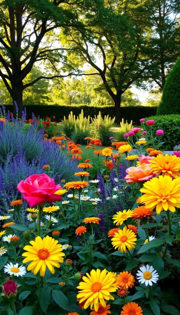
Transform your outdoor space into a living work of art without needing rare plants or costly upgrades. The secret? Thoughtful pairings that make every petal pop. Whether you’re a seasoned grower or just starting out, hues hold the power to turn ordinary beds into showstoppers that spark joy for everyone who sees them.
Strategic planning with hues lets you craft a landscape that feels intentional, even if your plant collection started as a mix of impulse buys. It’s not about strict rules—it’s about discovering combinations that mirror your personality. Warm oranges might energize a seating area, while cool blues could create a tranquil retreat near a water feature.
Explore contrasting tones for drama or blend similar shades for harmony. A single bold choice, like pairing violet salvias with golden marigolds, can redefine your entire space. For those seeking guidance, our friends at PHS Online offer brilliant insights on balancing vibrant displays with softer accents.
Your green sanctuary becomes a canvas where foliage and blooms collaborate. With smart placement and seasonal rotations, you’ll create ever-changing vistas that keep neighbors peeking over the fence all year long.
Understanding the Impact of Color in Garden Design
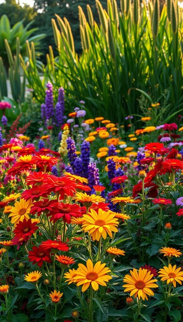
Your garden’s palette does more than beautify—it shapes how you feel in the space. Like choosing an outfit for an occasion, plant pairings communicate subtle messages. John Drexel of LandArt Garden Studio puts it perfectly: “Nature has given us a big box of crayons… your landscape’s colors depend on the mood you desire.”
The Role of Color in Setting the Mood
Warm tones like fiery red poppies or golden sunflowers energize seating areas, while cool lavender and sage hostas create Zen-like corners. Pastel peonies whisper relaxation, whereas bold hibiscus demands attention from across the yard. Think of it as dressing your outdoor room—playful daisy yellows for casual gatherings, elegant white roses for evening reflection.
Essential Elements for Color Harmony
Balance repetition and surprise to keep eyes moving. Try this formula: 60% dominant hues, 30% secondary shades, 10% accents. Pair perennials with matching annuals for season-long flow. Garden design color schemes work best when they mirror nature’s own patterns—think sunset gradients or forest-floor contrasts.
| Color Type | Mood Effect | Plant Examples |
|---|---|---|
| Warm | Energizing, Social | Marigolds, Red Hot Pokers |
| Cool | Calming, Reflective | Hydrangeas, Russian Sage |
| Neutral | Balancing, Grounding | Lamb’s Ear, Dusty Miller |
Remember: harmony doesn’t mean matchy-matchy. A splash of orange beside purple creates excitement without chaos. Repeat key shades in different textures—velvety petals next to spiky leaves—to build depth that feels intentional.
Picking the Ideal Color Palette for Your Backyard Flower Garden
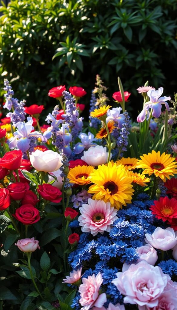
Your outdoor oasis becomes uniquely yours when it reflects the hues you love most. Start by looking at the shades you’ve chosen for your living room walls or favorite outfits—these natural preferences often translate beautifully to plant selections. Don’t be surprised if that mustard yellow couch inspires golden coreopsis plantings or your go-to navy sweater becomes a guide for midnight-blue salvias.
Selecting Shades That Resonate With You
Notice how certain tones make you feel energized or calm. A vibrant coral zinnia might lift your mood, while soft lavender phlox could create serenity near a bench. Landscape designer Mara Thornton notes: “Your space should sing your song—if peach geraniums make you smile every morning, that’s your chorus.”
Consider your home’s exterior when planning. A brick-red door pops against white Shasta daisies, while sage-green shutters harmonize with purple coneflowers. This connection turns your property into a unified masterpiece rather than separate elements.
Begin with one anchor color you adore, then layer in companions. Love pink? Pair hot magenta roses with softer blush cosmos. Add depth through foliage—silver artemisia leaves make crimson poppies glow brighter. Remember: sunlight changes everything. Test paint swatches outside before committing to blooms.
Eye-Catching Color Combos for a Backyard Flower Garden Aesthetic
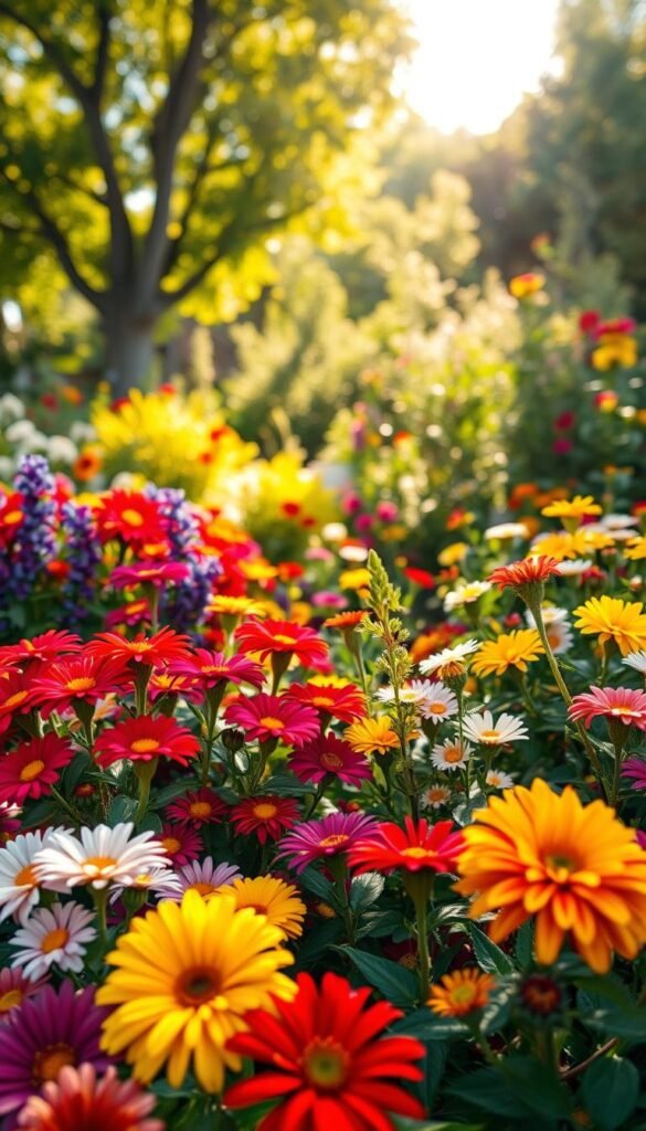
The magic of your outdoor canvas lies in pairing plants that play off each other’s strengths. Start by asking: “Do these partners share a texture or shape but clash beautifully in tone?” This approach builds partnerships where spiky red snapdragons might dance with round white zinnias, creating rhythm through contrast.
Strong visual pairings work like magnets for attention. Place fiery coral bells beside cool blue delphiniums near seating areas to guide guests’ gazes. These vibrant duos can cleverly disguise utility boxes or uneven fencing when positioned strategically.
Distance changes everything in plant partnerships. What looks like a soft pink-and-yellow blend up close becomes a bold stripe of color from your kitchen window. Test your combinations by viewing them from multiple angles and elevations.
Timing matters as much as tone. Pair early-blooming purple iris with late-summer goldenrod for sequential fireworks. Don’t forget foliage—burgundy heuchera leaves keep the show going long after peonies fade, especially when elevating your garden’s visual appeal through layered textures.
Remember: the best plant pairs tell a story. Maybe it’s the drama of black hollyhocks against lemon daylilies, or the quiet harmony of blue flax weaving through silver mound. Let your choices reflect what makes your space uniquely inviting.
Mastering Contrast: Complementary Color Schemes for Maximum Impact
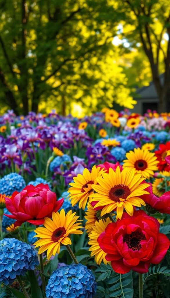
Unlock your garden’s full visual potential by harnessing color relationships that spark excitement. Complementary pairings—those sitting opposite each other on the color wheel—deliver instant drama while making both hues appear richer. Think sunset oranges glowing against twilight blues or marigolds popping beside lavender spikes.
How to Use the Color Wheel Effectively
Start by identifying your star color. If you love violet, its complement is sunny yellow. Instead of pure purple and lemon, try softer versions—like lavender paired with peach-toned daylilies. Landscape designer Elena Carter advises: “Use your main color as the chorus and its complement as backup singers—present but not overpowering.”
Create depth by mixing shades within one family. Pair deep navy salvias with pale orange calendula, then add coral snapdragons as bridges between extremes. Neutral foliage like ferns or ornamental grasses acts as a visual buffer, letting bold combinations breathe.
Tips to Avoid Overwhelming Contrast
Limit high-impact pairings to focal points. A red-and-green combo works brilliantly near seating areas but becomes exhausting across large beds. Instead, use 70% dominant colors and 30% accents—soft blue hydrangeas with burnt orange mums in clustered pots.
Introduce texture variations to soften intensity. Velvety purple petunias feel less jarring against spiky golden yarrow than smooth blooms would. For timeless appeal, blend these vibrant duos with vintage-inspired structural elements that ground the space.
Harmonizing with Monochromatic and Analogous Approaches
Creating visual unity in your green space becomes effortless when working with nature’s built-in relationships. Two timeless strategies—monochromatic depth and analogous flow—let you craft stunning displays that feel both intentional and relaxed.
Exploring Monochromatic Designs
Choose one core hue and explore its full spectrum. A white-themed bed might combine snowdrops, shasta daisies, and ivory roses. Vary textures with feathery astilbes beside glossy camellias. Designer Lila Monroe notes: “Monochromatic doesn’t mean monotonous—silver artemisia leaves add moonlight to midnight-blue lobelias.”
| Scheme Type | Key Benefit | Plant Example |
|---|---|---|
| Monochromatic | Simplified harmony | Pink peonies + mauve sage |
| Analogous | Natural transitions | Coral begonias + tangerine marigolds |
Blending Analogous Hues for a Cohesive Look
Pick three neighbors on the color wheel for effortless flow. A sunset-inspired bed could blend golden coreopsis, peach coneflowers, and ruby celosia. These schemes mirror how colors appear in meadows, creating instinctive appeal.
Balance intensity by mixing light and dark versions. Pair pale yellow daylilies with burnt orange dahlias, using violet salvia as a bridge. This approach works beautifully when combining unique flower varieties for layered interest.
Layering Plants and Textures for a Dynamic Landscape
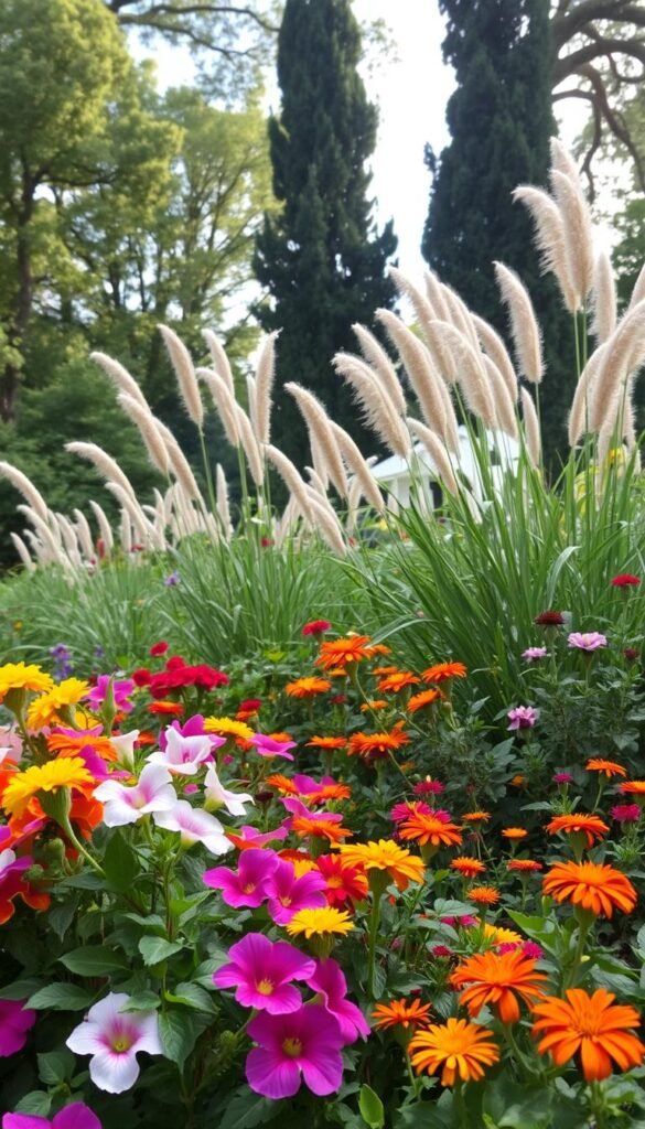
Build living depth in your outdoor space by stacking plants like nature does. Tall trees form the ceiling, shrubs create middle structure, and perennials fill the lower tiers. This approach turns flat beds into 3D wonderlands where every level contributes to the show.
Integrating Foliage and Bloom Variations
Leaves work overtime when blooms take breaks. Silver lamb’s ear or burgundy coral bells keep beds lively between flower cycles. Mix feathery ferns with broad hosta leaves to create texture contrast that catches sunlight differently throughout the day.
Seasonal shifts become design opportunities. Pair spring-blooming tulips with summer phlox and autumn sedum. Winterberry holly adds scarlet pops against snow while witch hazel blooms when most plants sleep. Landscape designer Rachel Carson suggests: “Treat your planting like a theater production—always have something entering stage left as others exit right.”
| Plant Layer | Role | Examples |
|---|---|---|
| Vertical | Structure/Height | Redbud trees, Tall grasses |
| Mid-Level | Texture Transition | Hydrangeas, Russian sage |
| Ground | Color Foundation | Creeping thyme, Ajuga |
Vary growth habits for natural movement. Upright snapdragons guide eyes upward while trailing sweet potato vine spills over edges. This mix makes beds feel lived-in rather than staged. Remember—contrasting leaf sizes (like giant elephant ears beside delicate maidenhair fern) creates drama without flowers.
Drawing Inspiration from Natural Settings and Wildlife
Nature holds the blueprint for breathtaking plant partnerships that thrive effortlessly. Observe how wild spaces balance vibrancy and harmony—lessons you can adapt to your own green sanctuary. These organic arrangements often outperform human-designed beds, having evolved through seasons of trial and error.
Wildlife-Friendly Pairings That Pop
Notice how purple New England asters naturally mingle with goldenrod in autumn meadows. This classic duo demonstrates nature’s genius for contrast—deep violet petals against sunny yellow plumes. Ethan Kauffman of Stoneleigh Garden suggests: “Native milkweeds create living art when monarch butterflies flock to their pink and orange blooms.”
Virginia bluebells paired with celandine poppies show how woodland plants master soft contrasts. Their blue-and-yellow dance works because they share similar growth patterns but different hues. Wildlife interactions amplify these combinations—imagine black swallowtails sipping from purple coneflowers surrounded by black-eyed Susans.
Summer gardens gain energy from nature’s playbook. Try mimicking prairie ecosystems where green grasses offset fiery blanket flowers. These relationships don’t just look stunning—they support local ecosystems too. By observing what grows together in wild spaces, you’ll discover low-maintenance beauty that feels utterly authentic.

