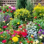
Your outdoor space becomes a living canvas when you harness the power of strategic color choices. Whether you’re starting fresh or refreshing an existing layout, thoughtful combinations can elevate your landscape from ordinary to extraordinary. The right palette creates harmony, guides the eye, and even influences how you feel in your personal oasis.
Why does color theory matter? Warm tones like fiery reds and sunny yellows energize your surroundings, while cool blues and soft lavenders bring calm. Balancing these hues helps craft moods that match your vision—whether you want vibrant energy or peaceful retreat vibes.
Coordinating shades isn’t just about aesthetics. It unifies different areas, making pathways, beds, and borders feel intentional. Seasonal shifts offer opportunities too: spring pastels, summer boldness, autumn golds—each phase keeps your design dynamic without losing cohesion.
Ready to experiment? With smart planning, you’ll create a space that delights year-round and reflects your unique style. Let’s explore how to blend science and artistry for results that truly grow on you.
Understanding the Basics of Garden Color Theory

Unlock your landscape’s full potential by mastering color relationships. The right combinations create visual rhythm and emotional impact, turning ordinary spaces into captivating experiences. Let’s start with the essential tool every designer uses: the color wheel.
The Role of the Color Wheel in Your Garden
This circular diagram reveals how hues interact. Warm tones like crimson and gold command attention, while cool shades like sage and periwinkle recede softly. By studying these connections, you’ll create balanced arrangements that guide the eye naturally.
| Color Type | Examples | Design Impact |
|---|---|---|
| Primary | Ruby red, sunflower yellow | Bold focal points |
| Secondary | Citrus orange, lavender | Smooth transitions |
| Tertiary | Peach, teal | Subtle complexity |
Primary, Secondary, and Tertiary Colors Explained
Start with three building blocks: red, yellow, and blue. These pure primary colors work best as accents. Mix two primaries to get secondary shades like orange or purple – ideal for connecting bold elements.
Tertiary colors emerge when you blend a primary with its neighbor. Think coral (red-orange) or aquamarine (blue-green). These nuanced tones add sophistication, especially when repeated through different plant textures.
Remember saturation levels too. The wheel’s inner rings show muted versions of colors, perfect for softening intense areas. Outer rings display vibrant hues that make statements.
Implementing Flower Garden Inspiration: Creative Color Schemes and Themes to Try in Your Outdoor Space

Transform your yard into a personalized retreat by aligning hues with purpose. Before selecting plants, decide what mood you want each zone to evoke. Serene corners thrive with misty blues and frothy whites, while barbecue spots pop with zesty oranges and crimson accents.
Matching Colors to Function
Walk through your outdoor space and note how you use each area. Dining patios benefit from warm reds that stimulate conversation. Reading benches pair well with lavender’s calming effect. Your home’s exterior paint or stonework should influence choices too – echo these tones for seamless transitions.
| Mood Type | Color Examples | Best Locations |
|---|---|---|
| Tranquil | Periwinkle, pearl | Water features, hammock zones |
| Energetic | Tangerine, magenta | Fire pits, play areas |
| Balanced | Sage, buttercream | Path edges, seating walls |
Limit your main color schemes to three hues maximum. A monochromatic approach using varying shades of purple creates sophistication without clutter. Test how sunlight alters tones – morning gold intensifies yellows, while dusk softens burgundies.
Architectural details matter. Modern homes shine with bold contrasts, while cottages favor softer blends. Regional influences count too – desert landscapes harmonize with terracotta tones, woodland areas with mossy greens. Your personal style should guide final decisions, creating spaces that feel authentically yours.
Designing with Complementary and Analogous Color Combinations

Elevate your landscape’s visual drama through strategic color pairings. Two approaches deliver distinct effects: fiery contrasts that command attention and gentle blends that soothe the senses. Let’s explore how opposite and neighboring hues shape your space’s personality.
How Complementary Colors Create Vibrant Contrasts
Opposite color wheel pairings spark instant energy. Imagine fiery red Crape Myrtles against blue Meadow Sage – this bold combo makes both shades pop. These combinations work best as focal points, like framing entryways or highlighting water features.
Balance is crucial. Pair bright yellow Black-Eyed Susans with violet Salvia, then soften edges with silver Dusty Miller foliage. This prevents sensory overload while maintaining excitement.
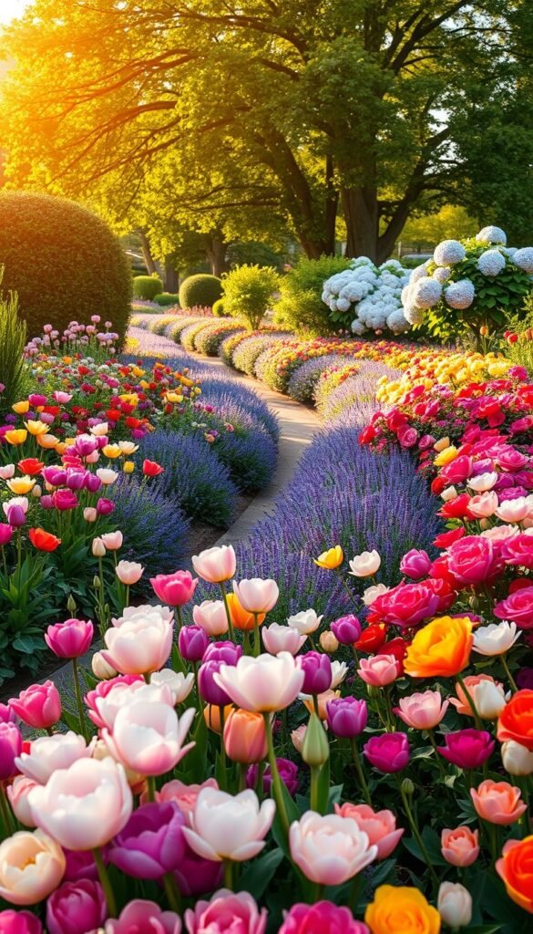
The Benefits of Analogous Color Schemes for Harmony
Neighboring hues on the wheel create effortless flow. A sunset-inspired blend of red Geraniums, orange Marigolds, and golden Coreopsis feels naturally unified. These combinations excel in relaxation zones or along winding paths.
Vary intensities for depth. Try crimson Peonies fading into coral Begonias, then butter-yellow Daylilies. This gradient approach adds interest without disrupting harmony. Analogous schemes adapt beautifully through seasons, easing transitions between bloom cycles.
Selecting Plants and Foliage to Enhance Your Color Palette

Craft your landscape’s visual story through intentional plant selection. Beyond blooms, consider bark textures, leaf shapes, and seasonal shifts that keep your color palette vibrant year-round. Smart choices create layered interest even when flowers fade.
Building Your Botanical Toolkit
Green foliage acts as nature’s neutral backdrop. Mix blue-green Hostas with golden Hakone Grass to create depth. For contrast, add purple Coral Bells or red Japanese Maples. These non-flowering elements maintain structure between bloom cycles.
| Foliage Type | Color Range | Design Role |
|---|---|---|
| Evergreen | Pine green to silver | Year-round foundation |
| Variegated | White-edged, striped | Light reflection |
| Seasonal | Burgundy, copper | Dynamic accents |
Mastering Nature’s Calendar
Stagger bloom times like a pro. Plant early risers like Crocus with late performers like Sedum. Ninebark shrubs offer spring flowers, summer foliage, and winter bark interest. This strategy prevents color gaps while maximizing visual impact.
Remember height variations. Tall Joe-Pye Weed adds vertical bursts, while creeping Thyme weaves colors across beds. Pair feathery grasses with broad-leaved Hostas to enhance texture contrast. Your palette stays lively through every season.
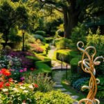
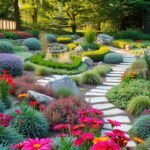
Incorporating Hardscape Elements to Reinforce Your Design

Permanent structures shape your landscape’s character while anchoring seasonal displays. Unlike plants that cycle through bloom phases, features like stonework and metal accents maintain color consistency year-round. They act as visual bookmarks, guiding eyes through your space even when petals fade.
Using Pathways, Walls, and Ornaments Effectively
Walkways become design tools when lined with purposeful materials. Edge a gravel path with Black Scallop Ajuga for midnight-hued drama that complements deep burgundy Heucheras. This creates rhythm while echoing darker tones in nearby plantings.
Retaining walls offer vertical real estate for color repetition. Match sandstone blocks to golden Coreopsis blooms, or paint wooden edging to mirror nearby lavender spikes. These intentional pairings make man-made elements feel organically integrated.
Accessories provide finishing touches that tie schemes together:
- Rust-colored ceramic pots repeat terracotta patio tiles
- Slate-blue benches mirror hydrangea clusters
- Copper wind sculptures pick up autumn foliage tones
Choose hardscape materials based on temperature. Cool white pebbles enhance silver-leafed Artemisia, while warm terracotta pavers intensify orange Marigolds. This synergy between fixed and living elements builds cohesive design narratives that evolve gracefully through seasons.
Creative Tips and Tricks for a Vibrant, Harmonious Garden
Refine your outdoor sanctuary with clever strategies that balance excitement and calm. Smart placement of vivid accents paired with thoughtful upkeep keeps your space looking polished through every season.
Balancing Bold Hues with Subdued Tones
Place fiery reds and zesty oranges where eyes naturally rest—near seating areas or entryways. Surround these bursts with misty blues or silvery foliage to prevent sensory overload. Group three to five similar plants together for bold drifts that command attention without chaos.
Test combinations before committing. At nurseries, place potted specimens side-by-side to see how cobalt Salvias interact with lilac Asters. This hands-on approach helps avoid clashing schemes.
Tools and Techniques for Ongoing Garden Maintenance
Keep displays crisp with monthly deadheading and strategic pruning. Replace spent annuals with seasonal stars that maintain your color story. For low-effort impact, try colorful container displays featuring drought-tolerant succulents or trailing verbenas.
Use charcoal-gray mulch to make pastel blooms pop, or golden bark chips to warm cool-toned beds. These subtle touches help unify your design while simplifying weed control.