Your outdoor space becomes more than just plants and soil when you approach it like an artist. Thoughtful combinations of hues and surfaces turn ordinary landscapes into living masterpieces that thrive in every season. Whether you’re starting fresh or refining an existing layout, understanding how natural elements work together unlocks endless creative potential.
Great gardens balance beauty with purpose. Plants do more than look pretty—they create pathways for the eye, support local ecosystems, and define the character of your yard. By mixing varied leaf shapes, bloom sizes, and bark patterns, you craft visual stories that evolve from spring blossoms to autumn foliage.
The secret lies in mastering design fundamentals. Consider how tall grasses add movement, while evergreens provide structure. Warm-toned flowers pop against cool stone features, and smooth pathways contrast with fuzzy lamb’s ear foliage. These intentional pairings create rhythm and unity without overwhelming the senses.
As you explore this guide, you’ll learn to make strategic choices that enhance your space’s natural flow. From selecting complementary plant groups to arranging focal points, every decision contributes to an environment that feels both exciting and restful. Let’s transform your yard into a cohesive retreat that delights visitors and nurtures local wildlife.
Understanding the Basics of Color Theory in Landscape Design

Crafting a vibrant garden starts with mastering color relationships. Think of your yard as a living canvas where strategic pairings guide the eye and shape emotions. The color wheel becomes your roadmap, showing how hues interact to create harmony or contrast.
The Role of the Color Wheel in Garden Planning
This circular diagram organizes colors into logical groups. Primary shades—blue, red, and yellow—form the foundation. Mix them to create secondary tones: orange (red+yellow), green (blue+yellow), and violet (red+blue).
| Color Type | Colors Included | Mood Created | Best Use |
|---|---|---|---|
| Warm | Red, Orange, Yellow | Energetic & Bold | Focal Points |
| Cool | Blue, Green, Violet | Calm & Relaxed | Backgrounds |
Primary and Secondary Colors in Your Outdoor Space
Use warm tones like sunny marigolds to highlight seating areas. Cool blues in hydrangeas make small spaces feel larger. Purple salvias work magic between zones, shifting appearance based on nearby plants.
Remember: yellow blooms pop against dark fences, while orange daylilies energize walkways. Pair blue hostas with gray stones for serene corners. These combinations help your landscape design feel intentional yet natural.
Exploring Diverse Color Schemes in Garden Design

Transform your garden into a living canvas by exploring color schemes that tell visual stories. These strategies help you create moods ranging from peaceful retreats to vibrant showstoppers. Let’s break down four approaches that turn random plantings into intentional designs.
Monochromatic and Analogous Schemes Explained
Monochromatic designs use one color in multiple shades. Picture lavender, deep violet, and pale lilac flowers mixed with silver-leafed plants. This approach feels cohesive yet dynamic through texture variations.
Analogous schemes combine neighboring colors on the wheel. Try yellow-green hostas with blue-green succulents and chartreuse sedum. These combinations create smooth transitions that feel natural, like sunset gradients.
Complementary and Riotous Color Strategies
Opposite colors on the wheel create electric contrasts. Purple salvias behind golden marigolds make both hues appear brighter. Use this technique sparingly – let one color dominate to avoid visual chaos.
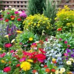
Bold riotous schemes mix multiple vibrant colors successfully. Repeat key shades like red or orange throughout beds to unify the look. This method works beautifully in gardening aesthetic designs where energy matters more than subtlety.
| Scheme Type | Colors Used | Visual Impact | Best For |
|---|---|---|---|
| Monochromatic | Variations of one hue | Calming & Unified | Small Spaces |
| Analogous | Adjacent wheel colors | Natural Flow | Curved Pathways |
| Complementary | Opposite pairs | High Contrast | Focal Points |
| Riotous | 4+ vibrant colors | Energetic Display | Large Gardens |
Remember: green foliage acts as a neutral in any scheme. Variegated leaves add pattern interest without competing with blooms. Test combinations using potted plants before permanent installation.
Incorporating Plant Foliage and Variegated Textures

Your garden’s leaves can steal the show when you look beyond blossoms. While flowers come and go, foliage delivers lasting drama through shifting light and seasonal changes. This living tapestry offers more than background support—it becomes the main event with smart plant choices.
Foliage Colors Beyond Traditional Green
Discover plants where leaves outshine blooms. Coral bells flash metallic purple undersides, while coleus varieties mix neon pink with deep burgundy. These color-charged specimens maintain visual interest from spring thaw to first frost.
Variegated types add extra dimension. Picture caladiums with white-veined heart shapes or hostas edged in gold. Some leaves display sunset gradients—red fading to orange then yellow—like nature’s own ombré effect.
Texture plays partner to color. Pair spiky yucca with velvety lamb’s ear for tactile contrast. Glossy camellia leaves reflect sunlight differently than dusty miller’s frosted surface. These combinations create depth without crowding spaces.
Smart foliage placement considers lighting. Purple smoke bushes glow in morning light but fade at dusk. Golden Japanese forest grass brightens shady corners better than sun-baked spots. Test positions with potted plants before final planting.
Season-spanning color comes easy with these stars. While peonies bloom briefly, bronze sedum heads transition from summer green to autumn copper. Evergreen euonymus keeps cream-edged leaves all year, proving foliage works harder than fleeting flowers.
Designing with Seasonal Color Shifts
Nature’s calendar offers a rotating palette that smart gardeners harness for year-round beauty. Your outdoor space can transform four times annually, revealing new dimensions through strategic plant choices. This approach keeps your landscape fresh and engaging, whether snow blankets the ground or spring buds burst open.
Embracing Spring, Summer, Fall, and Winter Hues
Start with spring’s soft pastels—white cherry blossoms against pink hellebores create delicate contrasts. As temperatures rise, transition to summer’s lush greens using hostas and ferns. These act as living umbrellas, providing cool shade for patio container gardening displays.
Autumn demands drama. Maple trees ignite in crimson, while ornamental grasses wave copper plumes. Winter reveals hidden beauty—red twig dogwoods flash ruby stems against snow, and paperbark maples peel to show cinnamon-toned trunks.
Evergreens like spruce and boxwood maintain structure during colder months. Pair them with deciduous shrubs boasting textured bark, like river birch or oakleaf hydrangea. Pro tip: Leave some perennials unpruned—seed heads and dried flowers add sculptural interest until spring returns.
Anticipate color transitions by grouping plants with complementary seasonal changes. A viburnum that blooms white in spring often bears red berries in winter, creating two moments of impact. This layered approach ensures every season tells its own compelling story.
Harmonizing Colors and Textures for a Balanced Garden Design

Your garden’s atmosphere begins with intentional color choices that shape how visitors feel. Imagine stepping into a space where vibrant blooms and varied leaf surfaces work together to create a welcoming environment. This harmony doesn’t happen by accident—it’s built through strategic decisions that consider both immediate appeal and lasting cohesion.
Guidelines for Effective Color Selection
Cool blues near seating areas promote relaxation, while warm oranges along walkways energize movement. Surrounding elements dramatically shift perceptions—a red rose against a white fence appears brighter than when planted near brick walls. Test combinations using potted plants to see how sunlight and shadows alter their appearance throughout the day.
Integrating Varied Textures for Visual Interest
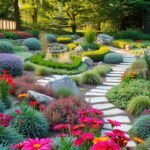
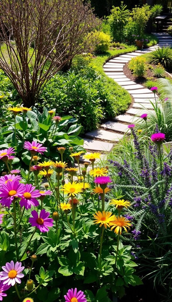
Feathery grasses paired with glossy camellia leaves add tactile contrast that catches the eye. Rough stone pathways gain elegance when bordered by velvety Stachys byzantina (lamb’s ear). These pairings create depth without overwhelming your color story.
For dynamic balance, mix bold hosta leaves with delicate ferns. Spiky yucca plants contrast beautifully with flowing groundcovers like creeping thyme. Discover more techniques in our balanced landscape design guide to refine your approach.
Planning for Modern Hardscape and Soft Plant Elements

Modern gardens thrive when architecture meets nature’s spontaneity. Clean lines of concrete or steel gain warmth through strategic plant pairings, creating spaces that feel both intentional and inviting. This approach transforms rigid structures into living designs that evolve with the seasons.
Balancing Bold Colors with Clean Hardscape Lines
Large concrete pavers set in gravel create crisp pathways that anchor your landscape design. Bright perennials like red salvias soften these geometric shapes, adding energy without chaos. Repeat paver patterns in seating areas to unify your site’s layout.
Steel edging keeps exuberant plants contained while adding industrial flair. Pair purple fountain grass with silver-toned metal for striking contrast. This interplay between hard and soft elements prevents sterile aesthetics while maintaining order.
Using Hedges and Edging for Structured Beauty
Low evergreen hedges work double duty in modern spaces. They divide garden “rooms” while hiding leggy perennials’ stems. Boxwood or yew varieties provide year-round form, framing colorful blooms like living picture frames.
Hedges also block unsightly views of utility areas or neighboring houses. Position them along property lines or between seating zones. Their dense foliage creates restful backdrops that make your flower choices pop.
Remember: consistent hedge heights maintain visual flow. Alternate clipped sections with loose ornamental grasses for textural variety. This balance keeps your design fresh yet cohesive across seasons.
Embracing Bold and Bright Plant Choices
Bright blooms and daring foliage turn ordinary yards into eye-catching retreats. Zinnias and marigolds shine in sun-drenched areas, their fiery hues demanding attention. For shaded spots, try coral begonias or golden calendula—these stars thrive where others fade.
Mix textures to amplify color impact. Pair spiky red celosia with velvety purple petunias in colorful container arrangements. Silver dusty miller leaves make orange nasturtiums pop, while blue borage flowers contrast brilliantly with yellow coreopsis.
Season-spanning drama comes easy with smart picks. Geraniums bloom relentlessly through summer heat, while pansies laugh at frost. Tropical cannas add height with striped leaves, and creeping thyme spills over edges with tiny purple flowers.
Remember: bold doesn’t mean chaotic. Repeat key shades in multiple zones for cohesion. Use green shrubs as neutral backdrops, letting your vibrant choices take center stage. With fearless plant selections, your space becomes a living celebration of nature’s brilliance.